Notification elements
By Karl Oskar Anderson on 18.12.2023Notification messages provide contextual feedback for user actions. They range from inline user action feedback texts to application level errors.
Overview
Displaying notifications effectively is crucial for providing a positive user experience. Notifications consist of type and message status.
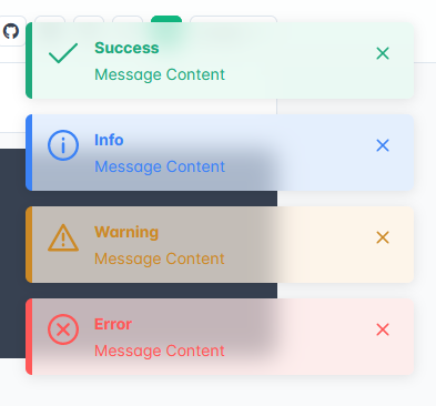
Notifications have four possible message statuses that is typically indicated by the error background and border color:
- Info - 🔵 blue
- Success - 🟢 green
- Warning - 🟡 yellow
- Error - 🔴 red
Error and success notifications help users understand action results, while informational and warning messages draw user attention to important details.
Notifications come in many forms depending on the disruptiveness of the message:
- Inline - Provide feedback about form status placed below or above the form, usually combined with input field validation.
- Toast - Short, usually temporary, messages that do not require a user action. Sometimes combined with a notification panel.
- Banner - System level reminders or error notifications located at the top of the page.
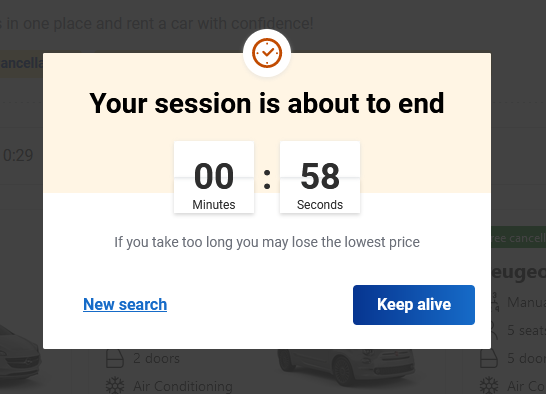
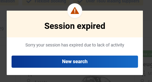
- Modal - Disruptive popups that block user activity for a important message.
Effective use of these notification types enhances user interaction and ensures a smoother user journey.
Inline
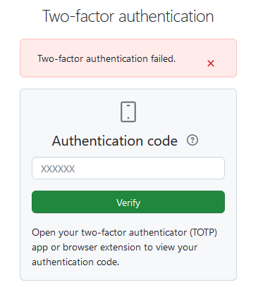
Inline notifications are complimentary to input field validation. Inline notifications are not exclusive to form validation, they can also be used to display form submit errors.
Inline notification
Inline notifications are typically used to show a form status.

Form validation includes an error summary notification and field error messages next to each erroneous answer. The error summary is particularly useful in large forms, guiding the user to the invalid fields. Following best UX principles, the error summary should be positioned above the submit button or at the top of the page (combined with a page refresh or navigate to the top scroll action).
Field validation
Field validation is used for validating individual form fields.

Field validation is done actively using a change event on the inputs. Unlike the input event that fires for every keystroke, the change event fires only when the focusout event occurs and the input has changed. This allows displaying errors once the user has completed typing. Validation happens on input changes and on submit button click. All field validations are controlled by a { errors: [], show: false } property that controls whether the error message is displayed or not.
Avoid using html validation tags like required and minlength as they only work on button click when e.preventDefault() is not called. Use Zod for handling validation logic.
See the Pen Input validation by Karl Oskar Anderson (@Karl-Oskar-Anderson) on CodePen.
Toast
Avoid error and warning toasts!
Toasts are short notifications usually placed at the bottom left or top left corner of the page. Toasts commonly disappear automatically after a couple of seconds.

Toast have a lot of UX problems:
- Users cannot fully read and understand auto-disappearing toast messages
- They appear far away from the problem area
- They block screen area
For these reasons it is best not to use a toast for error messages or other critical alerts that require user action. Consider alternative notification methods that provide a better user experience and ensure that important messages are effectively communicated to users.
Toast are straightforward to implement using a third party library as they are self-contained. However, there is no single universally maintained library. A quick Google search reveals many deprecated libraries like notyf, push.js, notify.js and toastr. One promising up-to-date framework agnostic library is toastify-js.
Banner
Banner notification provide a simple solution for displaying important info or handling unexpected request errors at the top of the page.


Banners are simple to implement without having to use any third party dependencies.
See the Pen Banner notification by Karl Oskar Anderson (@Karl-Oskar-Anderson) on CodePen.
Modal
Modals serve as effective tools for communicating important information to users when the current application state cannot be sustained, and a redirection is imminent upon user acknowledgment. Modals are commonly used for informing users about the expiration of the current browser session.

Modals prove valuable in alerting users about an impending redirection to another page, typically prompted by an error or an unexpected issue.

Consider using a shared modal component that defines the modal header and footer to create consistent modal style. Take a look at SweetAlert2 as an example of a consistent visual style for modals.